Archive
Egyptian youth given a voice in TIME Video multimedia piece
The cover of TIME this week featured seven young Egyptians who were involved in the revolution. TIME Video ran a multimedia feature to complement the cover story, which I thought was rather well done. The video is well-filmed, juxtaposing sequences of the Egyptians speaking with photos of them protesting and photos of Egypt during the revolution. But what really stood out to me was the way the feature portrayed Egyptians.
In our last online journalism class we spoke about stereotypes and how damaging it is for the media to perpetuate them. Additionally, I am taking a class about women in the Middle East, which focuses heavily on how Middle Eastern women are stereotyped in Western media. We established that the West tends to imagine Middle Eastern women as oppressed, acquiescent, and hidden. They are portrayed as objects to be “saved,” or politicized to make a point against Islam. Although steps are being taken to change this, we noticed that photographs from the front lines of the revolutions tend to show mostly men.
In this case, TIME did a great job of avoiding these stereotypes. Three out of the seven youths on the cover are women. They are varied in appearance – one wears a hijab (headscarf), one wears a keffiyeh (scarf/headdress) around her neck, and one is dressed without any cultural signifiers. Regardless of what they are wearing, all the women display equal agency and are outspoken about their desire for freedom and their vision for the state.
Some are speaking English, some speak Arabic and are translated, but all the Egyptians in the video speak passionately and confidently about the revolution. The great thing about TIME’s approach in this video is that it gives the Egyptians a direct voice and lets them express their perspectives without interference. “There was always this thing about how Egyptians are passive, but I think everyone proved that no, we want freedom,” says Sarah Abdelrahman. This is an amazing leap forward from dated (and often hypocritical) rhetoric that it is America’s job to step in and fight for democracy and defend freedom. By giving the Egyptian youth a direct platform to speak, TIME supports the underlying point of the revolution – direct democracy, called for by the people, built from the ground up.
Joy buzzers, Beanie Babies, NERF balls, oh my!
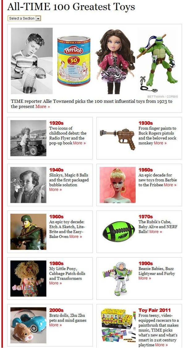
TIME recently put up a feature regarding the All-TIME 100 Greatest Toys (pun intended). The feature gave an extensive rundown of beloved toys, broken up by decade. Each toy gets its own page, a graphic, and an explanation of the toy’s function, history, and role in the context of its time. People can also leave comments on each toy. Looks like they’ve been taking pointers from their friends over at Techland!
Despite my usual skepticism at TIME’s features, this one is actually rather well carried out. Each blurb is short enough to keep people clicking but well researched enough to engage nerdier readers. (For example, I learned that Star Trek Electronic Phasers enabled kids to shoot their friends with faux-futuristic gadgets way before laser tag came around!) Lists are a good way to keep people on your site for a prolonged period of time. As a bonus, there’s nothing like extensive rundowns of toys, nostalgia and reminiscing to make people all warm and fuzzy inside.
All these things turn out to make a winning combination – at the time of this post, 13,150 people “liked” this on Facebook.
A quick follow-up
Just caught how the New York Times’ covered the deaths of Maria Shneider and Lena Nyman. Not surprisingly, their approach is far superior to Time’s. Both women get thorough obituaries which flesh out (no pun intended) their lives and offer their perspectives on the erotica films that made them famous.
Shneider is quoted as saying, “I felt humiliated, and to be honest I felt a little raped, both by Marlon and by Bertolucci. After the scene, Marlon didn’t console me or apologize. Thankfully, there was just one take.”
Nyman‘s thoughts, on the other hand, are more accepting. “You know,” she said, “some people get shocked about sex. I was shocked that everyone was so shocked. It was such a quarrel about that movie. Wow!”
This could be due to the different attitudes of the people making the movies, or perhaps the women’s different dispositions. Regardless, the Times recognizes the importance of giving the women a voice.
Finally, there’s a great critical op-ed piece by Manohla Dargis which contextualizes Last Tango in Paris and I Am Curious within their time and relates them to the contemporary portrayal of sex and romance in American cinema. This is a bit of a stretch to tie in because neither of the aforementioned movies were American, but it’s a great point nonetheless.
So much better.
Techland does something right
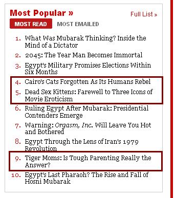
Caturday must’ve been in full force this weekend, because Time’s Most Popular list has not one but three titles with a feline focus. Awestruck by the idea that several people at Time decided that “Dead Sex Kittens” was an appropriate title for a triple obituary (or really anything besides the most sordid of snuff films), I fled to Techland for refuge.
Techies, not surprisingly, can be relied upon to use the internet correctly. Thanks to this truism, Techland is the only part of Time.com that’s attractively put together and user friendly. This has been accomplished by doing away with all of Time’s aesthetic decisions except the navigation bar at the top and replacing it with a pleasing blue-black color scheme, sans serif font, wider spread, organized headlines, eye-catching top content, and constantly updating news feeds and Twitter feeds.
As an added bonus, the content on Techland is well-reported and covers things that people interested in technology might reasonably be expected to care about, whether it’s new gadgets, tech culture, or viral videos.
In the spirit of competition, I thought I’d take a look at a feature listing the Top 10 Consumer Tech Rivalries and compare it with the grindhouse trainwreck that is the aforementioned Dead Sex Kittens post on Time’s main site.
The Techland feature cycles through ten tech rivalries, from the beloved old school duel of Nintendo vs Sega to the useful Internet Explorer vs Firefox vs Chrome vs Safari to the contentious PC vs Mac.
- Each rivalry is featured on its own page
- Each page features a snarky recap of the rivalry, and though it doesn’t stipulate who won, an intuitively Comments box could invite users to debate this themselves.
- Each page opens with a relevant YouTube video which is streamable without navigating away
- Techland has figured out hyperlinks.
The Time.com main content feature discusses three recently deceased movie stars (Maria Schneider, Lena Nyman, and Tura Satana), the movies they starred in, and their significance within the context of their time and erotic cinema as a whole.
- The article focuses primarily on each actress’s most well-known film, their directors, and their famously lurid content. There is little analysis or information about the women’s lives outside of the films and a brief nod to Schneider’s feelings of being exploited is the only time the article attempts to look at things from the perspective of the actresses themselves. This would be fine except that the headline implies that the focus is on the women themselves. Objectifying women posthumously should be offensive enough, but in accordance with the rest of Time.com, the article is also poorly presented.
- The feature consists of an introduction and three sections and is spread over four pages. However, instead of breaking these up accordingly (like the Techland feature), the content runs together and is broken up haphazardly.
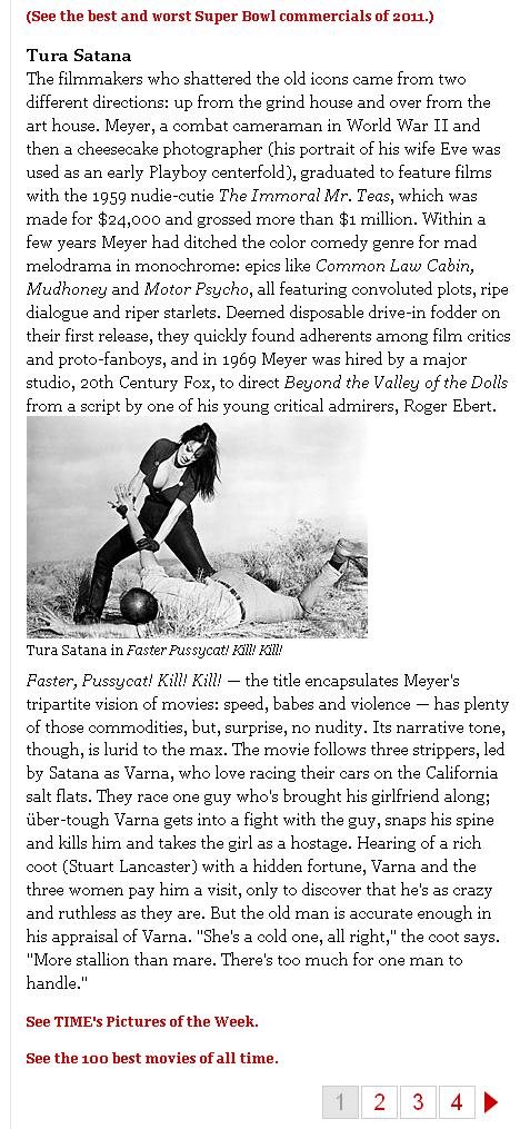
- Only two of the women featured get photos within their sections. (Shneider’s is at the top, which apparently means she does not get one when her name is actually mentioned.) Within the first two sections, the photos are found one paragraph down and are awkwardly sized, not covering the full width of the column.
- Instead of hyperlinks worked into the text there are awkwardly placed links to content which could be relevant (but is actually just distracting).
Final verdict’s apparent faster than you can say “revenge of the nerds:” Techland > Time.com main content, Doug Aamoth > Richard Corliss, live cute kittens > dead sex kittens, and Sega Genesis > NES. No contest.
A post-initial note on layout
All week long I’ve basically just been glued to Egypt coverage around the web, and Time’s approach to that hasn’t changed since the last post. Unfortunately, tearing myself away from Tahrir Square in search of other news to analyze means first contending with the organizational disaster that is Time’s layout, so I figured I’d touch on that instead. Magazine people know that layout is extremely important. For web publications, this is just as true if not more so – websites offer a lot more design choices than the physical structure of a printed magazine, and if a site is clunky and difficult to navigate, odds are people won’t bother with it for very long. Time.com utilizes a lot of the features news sites have grown to take advantage of.
- Interactive options – such as RSS subscription, mobile apps, Twitter feed, Facebook fan page
- A widgets that shows users what their Facebook friends are recommending
- Multimedia and photo stories (although the photos are in the clunky applet I mentioned in the last post)
- Additional content sorted by Must Reads, Latest Headlines, Most Read, Most Emailed, Inside Time.com, and…More Inside Time.com
- A variety of well-written and more or less well-formatted Blogs such as “Healthland,” “Techland,” and “Swampland” are thrown in among the regular columns.
- The “Quotes of the Day” section is a nice touch, and appears to be a unique feature
All this shows that Time has a handle on what online audiences are looking for. That’s the good news. The bad news is that many of the features on the home page are repetitive, poorly placed, or downright baffling. After staring at the home page for long enough, it begins to uncannily resemble a botched game of Tetris.

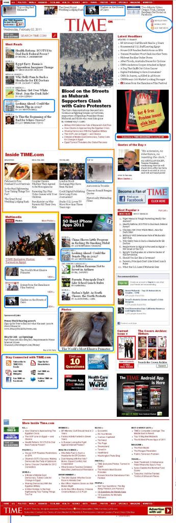
Glaring layout issues, color-coded by severity according to the NSA Threat Level color scheme. (Red is omitted because it's Time's main layout color.)
Let’s review:
- Orange Alert: What are these Must Reads and who decides them? They’re not Latest Headlines or Most Popular so they must be chosen by the editors. In that case, how are they at all different from the headlines found at the top of the page, or within Inside Time.com? And why do they continue down into a lost-looking middle column? (The Tetris analogy is really the only possible explanation.)
- Yellow Alert: Multimedia and Photos are buried halfway down the page, at the far left. Furthermore, a single photo story seems to have detached from the pack and found it’s way down below the blog stragglers, where it could easily be mistaken for an ad. The two ought to be combined and made bigger and more eye-grabbing.
- Blue Alert: Unnecessary repetition. Changes in the Senate, Cairo, blizzards, and elusive primates are surely all very newsworthy, but that should be emphasized by placing them near the head of the Must Reads, not repeating them throughout the home page.
- Purple Alert (Purple is not an actual color used by the National Threat Advisory): There are multiple headlines from the same area of interest thrown around the page. These could be better organized.
News is overwhelming, the Internet is overwhelming, there’s too much information to consume and more information is happening with every moment. This is a fact of online life and it can be alternately nauseating and exhilarating. But when I feel like down my already-fragile attention span with a seemingly random cavalcade of disorganized information, I just go on Twitter – at least it’s aesthetically pleasing. Publications, even on the web, are supposed to make all this information feel manageable, usually through layout decisions that give the illusion of organization. So although it’s taken some important steps, Time still has serious housekeeping to do.


